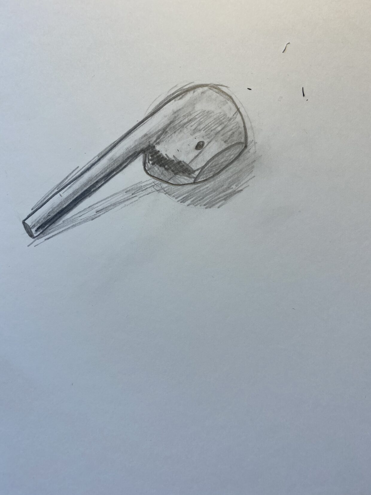
Here is my art digital sketchbook!
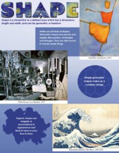
KQED element of shape video
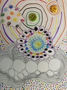
Dot art study
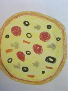
geometry pizza – shape exploration
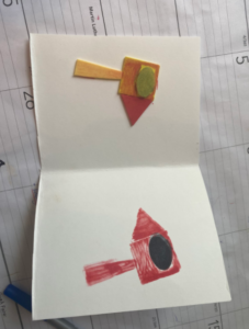
Foam shape stamp art
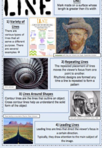
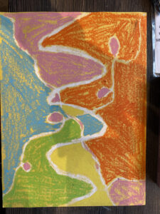
Pastel Batik
Harold and the purple crayon – story reading
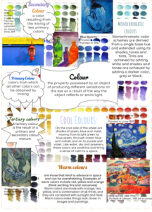
KQED – element of color video
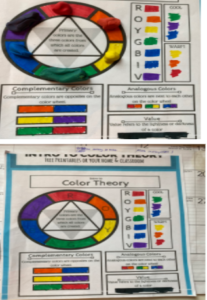
color theory worksheet – with plasticine above
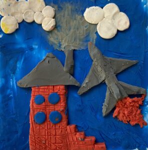
Plasticine relief
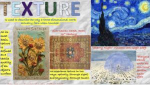
KQED – the element of texture
KQED – the element of form

‘mug’ sketch – a study of value and form
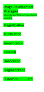
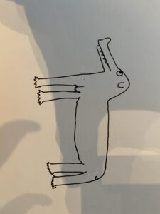
simplification step 1
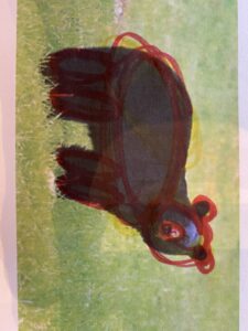
Simplification step 2
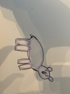
simplification step 3
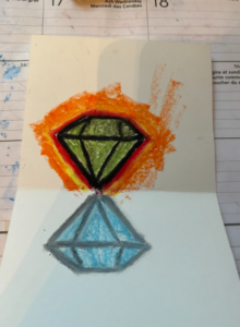
image development strategy – reversal
Lesson plan on the image development strategy of simplification
Assignment #2: Lesson Planning – Image Development Strategy Lesson
Name(s): Georgette & Bjorn
Grade Level: 3
Content: Element of Design: Shape
Aspect of that Element: Simple shapes to create more complex ones
Image Development Strategy: Simplification
Prior to the introduction of the Image Development Strategy, the students have worked with the aspect of the element of design by:
A unit on shape
Discovery Opening for Image Development Strategy:
Activity: Mainstreet View
Materials:
- Acrylic paint
- Paper
- Coloured sharpies
- Painters tape
- Scissors
Students will be tasked with creating their own view from across the street of a town. They can include recognizable buildings such as the town hall, a church, or a fire department. Students will trace the outline of their buildings by connecting simple blocked shapes to create complex ones and paint them bright colours to signify a season or feeling. Once the paint is dry they will use painters/masking tape to completely cover the buildings. They can then create a background for their town with a skyline, part of the road, etc. using contrasting or complementary colours. Once dry students can remove the tape and outline general shapes of the building using a coloured (not black) sharpie.
Formative Assessment:
Non-judgmental Critique:
What piece has shapes that stand out to you?
What piece makes you really feel like you’re looking at a town from across the street?
What piece uses colours that stand out?
Consolidation: Reasoning and Reflecting
- A) Critical Analysis Process:
Image(s) Artist: Ted Harrison
Name of Work: Carcross Summer
Date: 1989
URL https://tedharrison.ca/collections/all/products/carcross-summer-1989
1) Initial Reaction
How does this piece make you feel?
What do you look at first?
2) Description
What do you see?
What colours are the shapes in this piece? Does it look cold or warm?
3) Analysis
What Shapes do you see?
Where do you find these shapes?
Did you see any big shapes made up from a few smaller ones?
4) Cultural Context
Ted Harrison moved from england to canada where his family lived in the small town of Carcross just outside Whitehorse, in the Yukon.
He calls life a rainbow road with brilliant colours that contrast with dark tones. He uses his bright coloured shapes to show feelings of happiness and dark ones to show feelings of sadness or uncertainty.
5) Informed Point of View
Do you think the shapes he used reminds you of a small town in the Yukon?
Do you think the simple shapes make the painting clearer or less believable?
Formative Assessment:
Students will first reflect their work on the rubric then the teacher will review and add comments if needed.
In each box use a pencil crayon to show how you feel you did this while working on your art piece. Green=Excellent Yellow=Good Red=Needs Some More Work
Name:
| I used different shapes throughout my piece | I used bright colours that contrast each other | I used my creativity to make a piece unique to me |
| I created multiple buildings for my town | I used colour with meaning and purpose | I used clearly defined shapes outlined by marker |
| You can clearly see the difference between buildings and background | I used small simple shapes to create bigger, complex ones | My piece is simple and not too busy |
Notes:
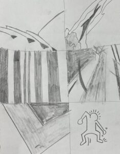
movement study
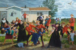
Kent Monkman critical analysis
critical analysis doc
2) Description
How does this piece make you feel?
What can you see happening?
What draws your attention first?
Have you seen any other art like this?
3) Analysis
What principle of design helps make this piece feel alive
What actions/ movements do you see happening, what element of design does the artist use to make movement so dramatic?
What elements of design help to identify the indigenous people from the settlers? (clothing colour)
4) Cultural Context
- The piece is called the ‘scream’ by Kent Monkman which was made as a part of an exhibition called ‘shame and prejudice’ which shows a different side of Canada’s 150. The piece excludes angels (a common addition that Kent Monkman adds to his paintings)
- The ‘scream’ is 84” by 132” (7 feet by 11 feet) and displayed in a “haunting black room” along with the toys and cradles of residential school children.
- The piece shows children being taken from their parents by clergy and mounties (people of authority and power) to go to residential school.
- Kent Monkman is an artist with Cree ancestry who creates art in painting, film, performance and installation styles. His art often contains humour or surrealism but this piece does not.
- “The mother in the foreground looks like the “Migrant Mother” in Dorothea Lange’s iconic depression era photograph of Florence Owens Thompson” (a mother who has lost everything during the great depression from the dust bowl)
How does the artist’s background affect his work?
How does the presentation of the piece affect the tone? (think the size and real artifacts displayed along with the art)
5) Informed Point of View
Do you notice anything new?
Has your opinion changed at all?
Have your emotions towards the piece changed at all?
critical analysis
Carbon paper drawing (form and texture)
my dynamic portrait picture with a black and white filter

The carbon paper process (printed image on top, carbon copying paper middle, and studio paper on the bottom)
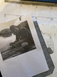
The drawing before the critical analysis
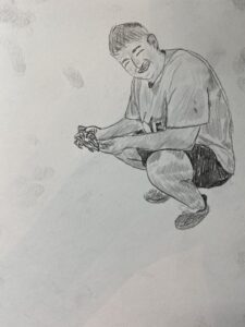
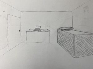
One point perspective bedroom
